Once you have set up all your campaigns and e-mails, you will probably want to know the results of your marketing activities. We have developed Deployteq Analytics for this purpose. Here you can retrieve your data about the Deployteq campaigns and e-mails in real time. Do you want to know the results of a specific e-mail or combination of e-mails? Do you want to compare this to a segment in your database? Or do you want to see the trends of the past few months or even years? No problem! Analytics allows you to configure your own dashboards and filters so that you can analyse your activities effectively and report on data that is relevant for you.
Default dashboard
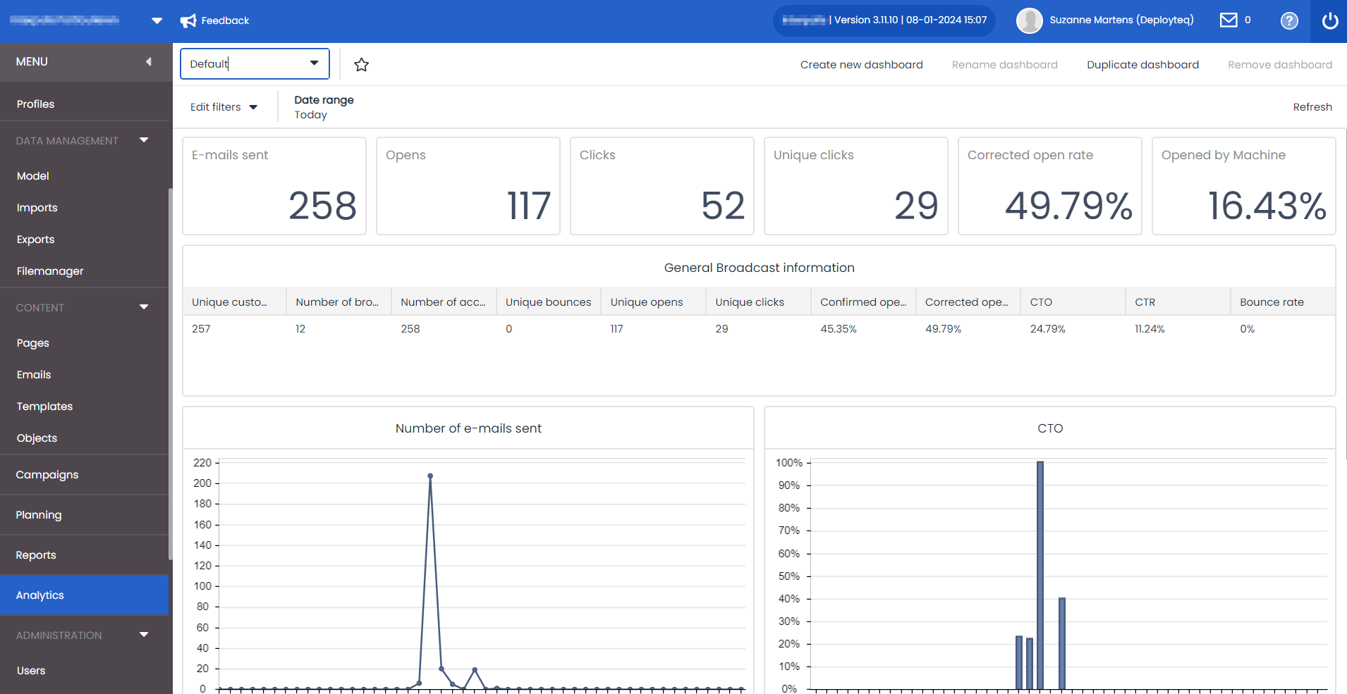
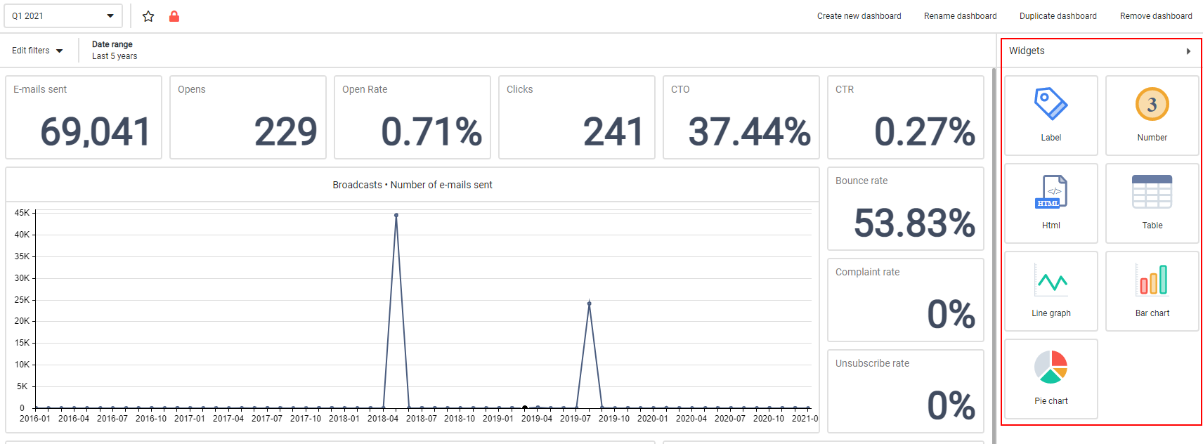
To help you get started straightaway, a standard dashboard has been prepared for you. This displays the standard e-mail figures such as the number of sent e-mails, opens, clicks, bounces, etc. Go to Analytics in the left-hand menu to display them and, if necessary, select Default from the drop-down menu at the top left.
Filters
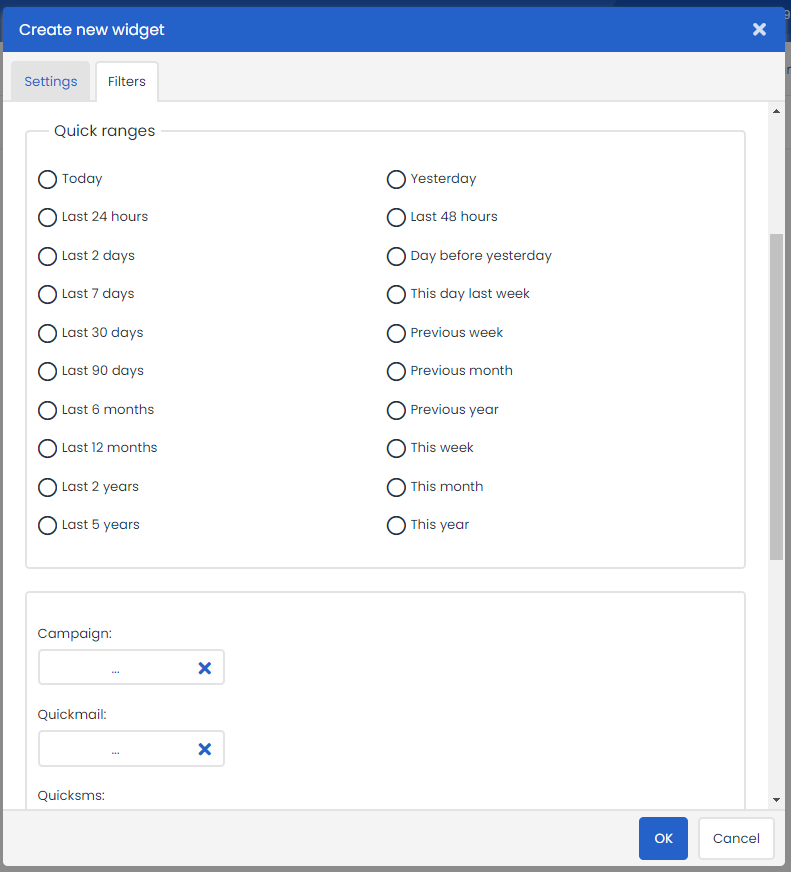
Filters can be used to modify the data that you see in the dashboard. There are numerous filters available for analysing your data. These filters can be placed over your entire dashboard or over individual blocks when you create your own custom dashboard. You’ll find more information about creating your dashboard further on in this page. Click on ‘Edit filters’ in the top left to see all the options for filtering the data on your dashboard.
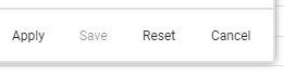
You can filter for several elements or a combination of several elements. Configure your filters and click on ‘Apply’ to immediately refresh the data with the new set ranges.
We have set out the following filter options for you:

Date range
Use the date range to analyse the data over a certain period, such as a specific month or to see the trend for the past twelve months. You can even fill in a date range using the date pickers on the left in your filter:
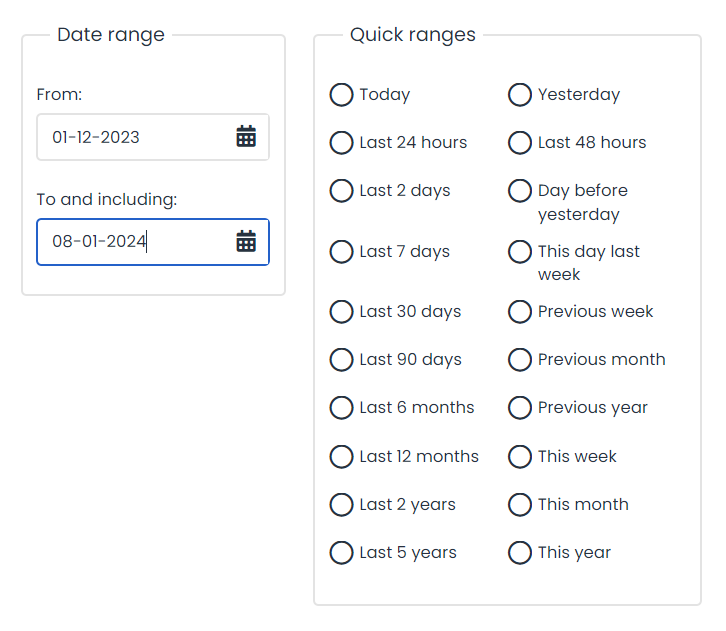
A number of standard date ranges have also been configured for you, such as the past X hours, days, months, or years, as well as the entire previous year. If, for example, it is now 2019, the ‘Last year’ date range will select from 1 January 2024 until 31 December 2024.
Specific contents
Although it may be very interesting to see how all your mailings and campaigns are doing, you may also want to see how a specific campaign or e-mail performed. You can therefore use specific contents to filter your data. If you want to include several mailings in the analysis, press CTRL or SHIFT and click on the e-mails in the list to expand the selection.

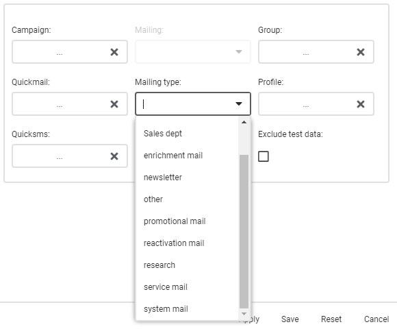
Mailing type
You want to see the trends as a whole but also want to separate your commercial e-mails from your transactional e-mails. This is understandable: transactional e-mails are often opened but not clicked in, and your commercial e-mails would also show a very different result.
This can best be done with a mailing type filter. If you configure this consistently for the e-mails and their broadcasts, you can easily apply your filters to them.
Segments
Lastly, you may want to see how certain segments open or click in their e-mails or what the deliverability is like. This can be done by using profiles and groups. Create your profile or group as you are used to doing in Deployteq and select it here to analyse your data according to certain customer profiles. In a simple example, you could see how women behave compared with men.
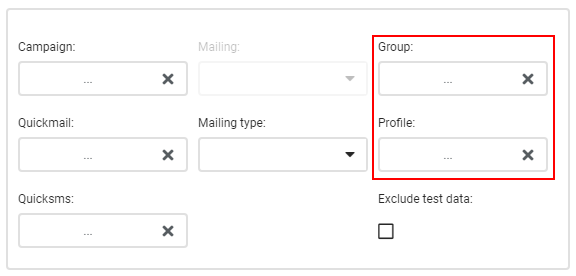
Exclude test data
WWhen you have marked your e-mails as a test mailing, e.g. via Quick Test, you can then exclude these mailings from your results. This can make a huge difference to your figures, especially if your target group is not that large or your test group is very large.
Save filters
When you are satisfied with your filters and are likely to use them in a dashboard more often, you can save the filter for the specific dashboard you are working in by clicking on the ‘Save’ button at the bottom right. The next time you open the dashboard, the saved filters will automatically be displayed.
Creating a dashboard
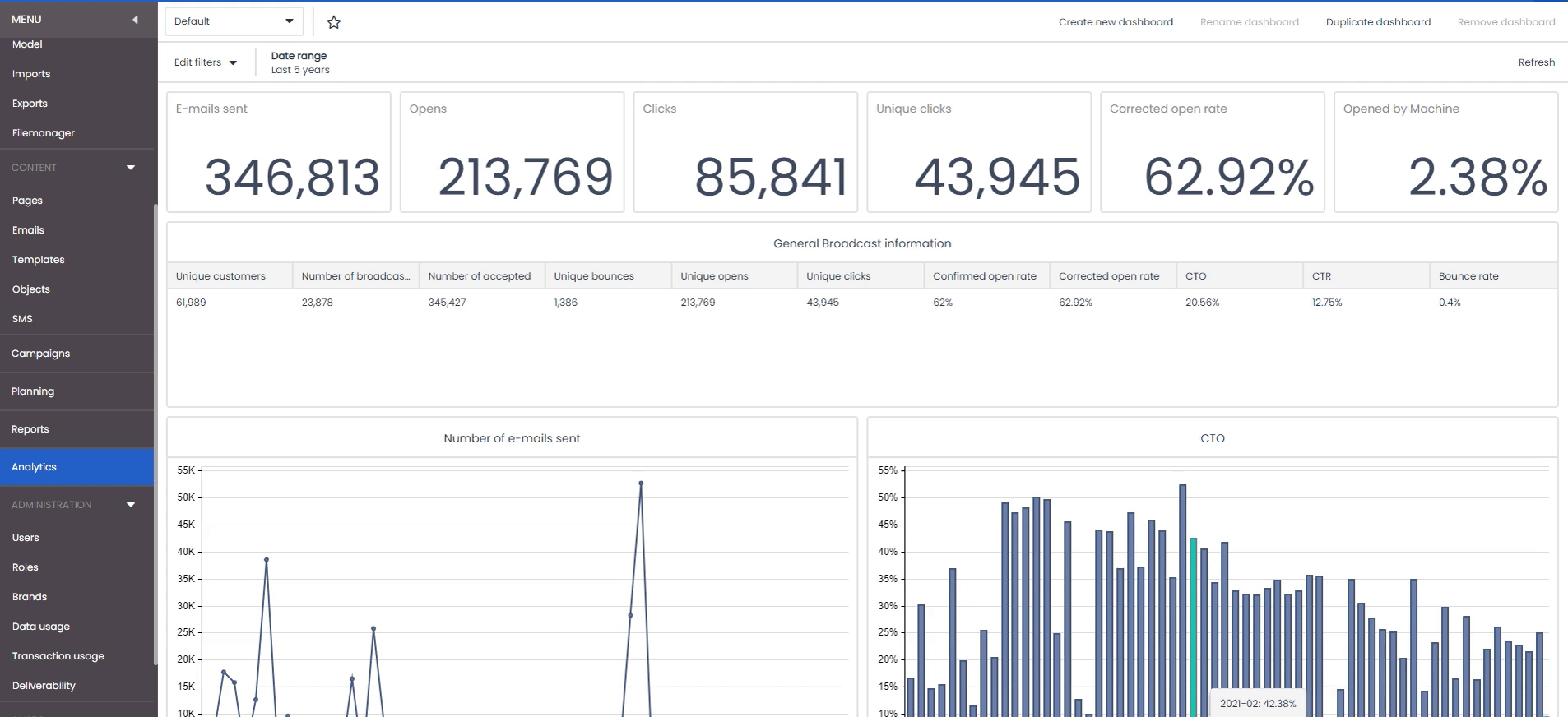
Every action has a different purpose and requires a different analysis on your dashboards. You can create separate dashboards for this purpose, using your own numbers and graphs.

At the top right of the Deployteq Analytics screen, you will see the four buttons you can use.
Create new dashboard
Use this to create a completely new dashboard and start with a blank canvas.- Duplicate
Use this to copy the current dashboard in order to create a different dashboard. This is a good option to use to experiment with the default database. - Rename dashboard
Give the current dashboard a new name. You cannot rename the default dashboard. - Delete dashboard
Delete the current dashboard. Please note that you cannot delete the default dashboard.
When you choose to create a new dashboard or to duplicate an existing dashboard, you will be asked to enter a name for your dashboard. This name will appear in the drop-down menu at the top left of your screen, so make it a descriptive name. You will then enter your new dashboard with a blank canvas. At the start, this dashboard can only be viewed by you. This is indicated by the red padlock icon at the top left next to the menu.
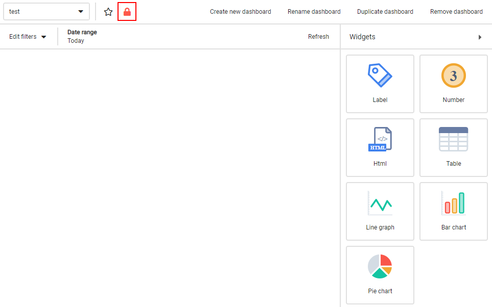
When you click on this padlock, the dashboard can also be viewed by your colleagues. Our support department will always be able to see your dashboards, so if you have any questions about their configuration, you can give us a call without having to make a dashboard public.
Widgets
You can now start filling your canvas by dragging and dropping widgets onto it. Widgets are blocks that you use to fill your dashboard. Add graphs, figures, labels, and even HTML to create a dashboard that is clear, fun and attractive, and informative.
To start, drag a widget from the right to the desired location on the left.
When you hover over the edges of an object with your mouse, you will see that you can make the object larger or smaller. You can therefore tailor your dashboard entirely to your requirements.
Widget values and filters
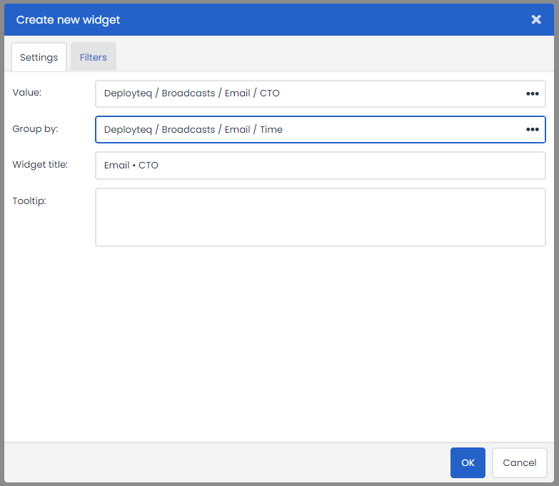
In the widgets, you first specify what data to display. When you create the widget or open it via the gear icon when you hover over it with your mouse, you can go to the settings to modify the widget. The settings differ per widget but, in general, you first need to specify what data you want to display. This could be data about the broadcast, a checkpoint in a campaign, or even about the weather. The widget will automatically be given the name of the selected data source, but this will often be too long to create a clearly organized dashboard. It is therefore important to give the widget a clear title so that the dashboard is easy to read. Finally, you can display the short notation for the numbers, e.g. 12,369 will then be displayed as 12k. This is useful to prevent confusion if you have figures over a lengthy period or if you send large mailings. This option can then be used.

You can also create a filter for each widget. If, for example, you have a campaign where you want to compare two mailings, or want to display last year’s figures with the figures for this year, you can modify this in the filters for each object. These filters per object are identical to the filters as described above, and are therefore based on time, content, or segments.
The different widgets
Below is an overview of the widgets and what you can use them for.
Label
A label is a piece of text that you can use to clarify your dashboard. For example, you could add headings to the different groups of numbers.
Number
This widget displays a number from the selected data and selected filters, such as the number of broadcasts, percentage of bouncers, or number of records that passed through a campaign checkpoint, etc.
HTML
The HTML widget displays a WYSIWYG editor in which you can add anything you like. This could be a legend, or some images or logos to make your dashboard more attractive.

Table
A table allows you to display various data in table form. You can also add multiple columns to a table. The data that you can show here will be linked to one another. In the example below, you can see the number of clicks over time displayed in a table.

Line graph, bar chart and pie chart
The line graph displays an extra option that you can configure. In addition to the data that you want to see, you can also group the data, such as the clicks over time.
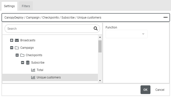
Measuring campaign checkpoints
A campaign has various objectives. At times, you will want to measure these objectives, and at other times, you may want to test hypotheses. You may want to conduct an A/B test, for example, or want to know how many customers pass through the flow and where they eventually drop out. It is therefore possible to add checkpoints in campaigns.
Select these checkpoints in Deployteq Analytics in order to display the figures.
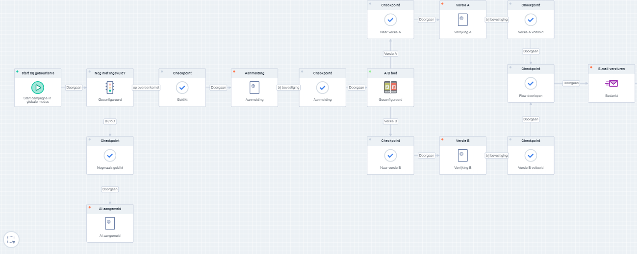
You could place a large number of checkpoints in your campaign for the purpose of collecting data. You don’t have to place them all in your dashboard straightaway, but it doesn’t hurt to perform measurements that you may need at a later stage.
The only thing you have to do in your campaign is to place the checkpoint object in it and give it a clear name. Make sure that there cannot be any special characters in the name of the checkpoint object.

You can then select the object in your Deployteq Analytics dashboard in the data selection under the ‘Checkpoints’ heading: